A neutral farmhouse room should feel like fresh sheets drying on a line, worn pine floors under bare feet, and the soft weight of a knit throw when the evening cools down. But when everything is white, cream, and “pretty,” it can also go a little flat. Sometimes a hint of color helps, but one of the most reliable fixes is more texture, layered on purpose.
I like to think of texture as the quiet music in a room. You might not notice it right away, but you feel it. Today we are going to build that feeling using four farmhouse MVPs: knits, galvanized metal, raw wood, and linen, all while staying inside a calm white and cream palette.
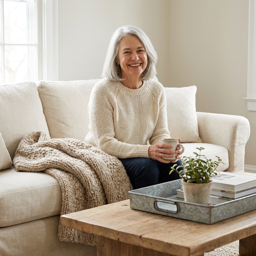
Why neutrals go flat
When a room is mostly white and cream, your eye has fewer color changes to grab onto. If the finishes are also similar, think smooth paint, smooth upholstery, smooth decor, everything blends into one big, bright “same.”
Texture creates contrast without introducing busy patterns or loud colors. The goal is to mix:
- Soft + hard (knit next to metal)
- Matte + subtle shine (linen next to galvanized)
- Refined + rough (tailored slipcover next to raw wood grain)
- Tight weave + chunky weave (grain sack stripe pillow next to a cable knit throw)
The texture formula
If you want an easy starting point, use this simple formula in each main zone (sofa area, bed, dining nook):
- 1 cozy textile: chunky knit, nubby wool, quilt, or boucle
- 1 relaxed textile: linen, cotton ticking, grain sack, or canvas
- 1 natural base: raw wood, rattan, seagrass, or stone
- 1 “cold” accent: galvanized metal, black iron, aged brass, or pewter
- 1 living element: greenery, branches, dried stems, or a bowl of citrus
You can repeat the formula in small ways all over the room. That repetition is what makes it feel pulled together, not cluttered.
Start with undertones
Neutral rooms look richer when they have undertone variety. You are still “white and cream,” but you are mixing temperatures and depths. Think:
- Warm cream (like heavy cream)
- Soft ivory (slightly buttery)
- Dusty white (a little gray or oatmeal in it)
My favorite trick is to keep the walls one consistent neutral, then layer slightly different neutrals in textiles so the room feels collected over time.
Knits
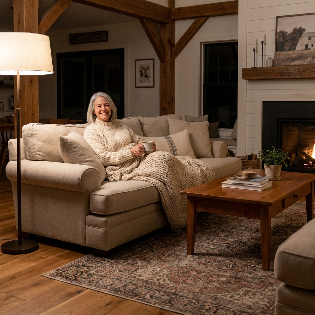
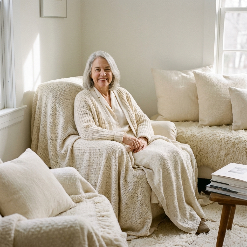
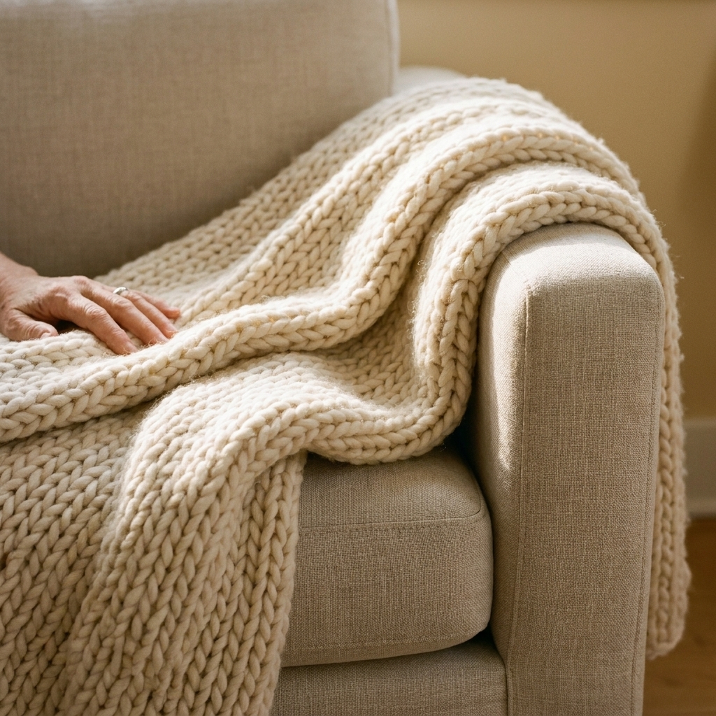
If I could only add one texture to a neutral farmhouse room, it would be a chunky knit. Knits break up smooth upholstery and painted surfaces instantly, and they add that “come sit down” feeling.
Where knits work best
- Over the arm of a sofa: casual, not fussy
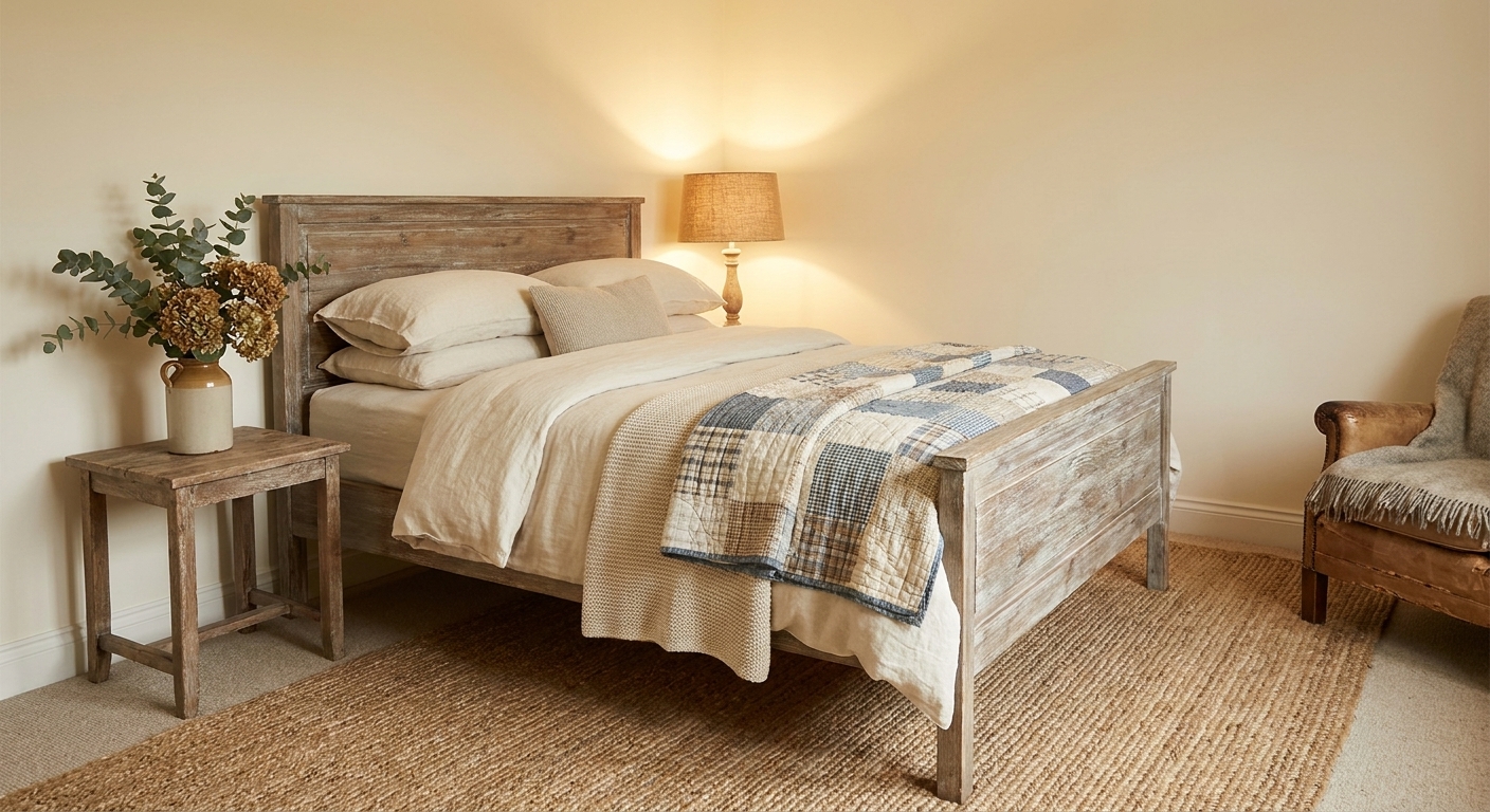
- At the foot of a bed: adds weight to all-white bedding
- In a basket: easy, functional styling that never looks staged
How to choose a knit
- Pick visible stitch definition (cable knit, ribbed, waffle).
- Aim for thick and dimensional rather than flat fleece.
- Mix cream with oatmeal so the knit stands out from bright white upholstery.
Styling note: Drape your throw so it shows folds and shadow. Texture reads best with light and shadow to bring out depth. Perfectly folded blankets can look strangely flat in a neutral room.
Real-life note: Chunky knits are cozy, but they can snag. If you have pets or heavy daily use, consider a tighter knit (ribbed or waffle) for the “workhorse” throw, and save the super chunky one for lighter wear.
Linen
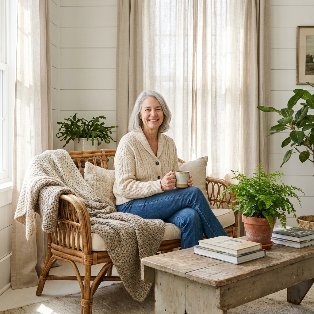
Linen is the friend who shows up in wrinkled clothes and somehow looks better than everyone else. In a neutral room, it brings a gentle, breezy texture that reads warm and natural, not cold and showroom.
Easy linen wins
- Linen pillow covers in ivory, flax, and soft white
- Linen curtains that filter light and soften hard edges
- A linen table runner for a farmhouse dining table
- Slipcovered seating if you want that cottage-farmhouse ease
Make it look layered
If your sofa is a linen blend, do not feel like you need matching linen everything. Mix in cotton, ticking, and even a tiny bit of subtle pattern (like a thin stripe). The point is variation.
Care note: Linen wrinkles. That is part of its charm, but if you want it to look relaxed instead of rumpled, steam curtains and covers occasionally and embrace a softer, broken-in finish over crisp perfection.
Raw wood
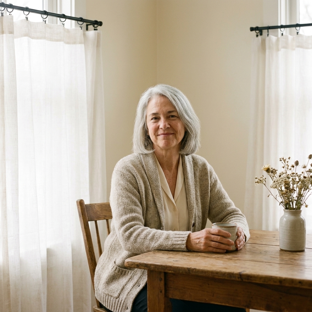
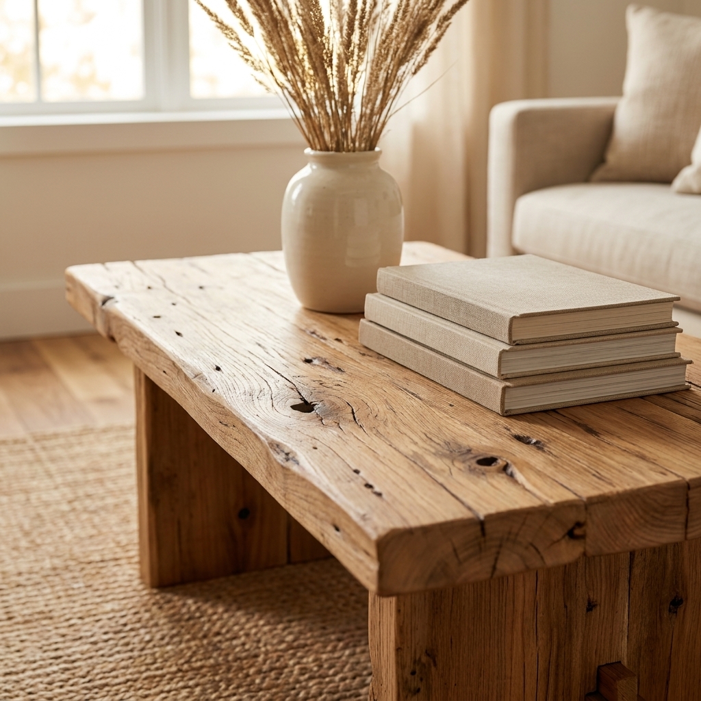
White and cream need something grounded, and raw wood does that better than almost anything. Wood also adds pattern naturally through grain, knots, saw marks, and wear.
Where to add raw wood
- One big piece: coffee table, dining table, bed frame, or a vintage dresser
- One mid-size piece: a stool, bench, or open shelving
- Little hits: cutting boards, picture frames, candle holders, or a riser under a vignette
Finish tips
- Choose matte or low-sheen finishes over glossy.
- Let some imperfections show. Dings and grain variations are part of the charm.
- If your room is very pale, go for medium to warm wood tones so the contrast is noticeable.
Mixing wood tones: It is fine to mix woods, especially in farmhouse spaces. Keep them in the same temperature family (warm with warm, or cooler with cooler), and repeat each tone at least twice so it looks intentional. If a wood is reading too yellow next to your creams, balance it with cooler pieces nearby (galvanized, black iron, or dusty whites) to calm it down.
I restored a lot of furniture in my little 1920s cottage, and I can tell you this: you do not need perfect wood. You need honest wood, the kind that looks like it has a story.
Galvanized metal
Galvanized metal is the unsung hero in a soft neutral palette. It adds a little edge and a gentle sheen, and it plays beautifully with both white and wood.
Simple ways to use it
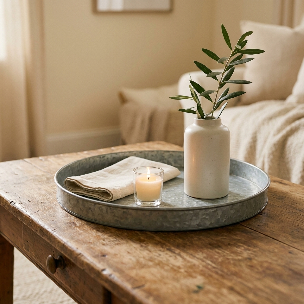
- A tray on an ottoman or coffee table to corral candles and remotes
- A small bucket as a planter or for wooden spoons
- A vintage-style bin on open shelving for linen napkins
- A metal pendant or sconce to add shine at eye level
Balance rule
Galvanized looks best when it is balanced with something soft right next to it. A metal tray on a raw wood table, topped with a knit coaster or a linen napkin, is the perfect little texture sandwich.
Layer by room
Living room
- Sofa: linen or cotton slipcover in warm white
- Pillows: 1 linen, 1 subtle stripe or ticking, 1 nubby or boucle
- Throw: chunky knit in cream or oatmeal
- Table: raw wood coffee table or end table
- Accent: galvanized tray or vintage metal bucket with greenery
Bedroom
- Sheets: crisp cotton percale for a “cool” texture
- Duvet: linen or a quilted coverlet for a softer texture
- Throw: cable knit at the foot of the bed
- Nightstand: raw wood or a painted piece with a worn top
- Accent: small galvanized lamp base or metal catchall dish
Dining nook
- Table: raw wood top, even better if it shows grain
- Runner: relaxed linen in flax or soft white
- Center: galvanized vessel with branches or eucalyptus
- Seating: mix wood chairs with a cushioned bench, or add a knit chair pad
Quick texture recipes
If styling makes you freeze up, you are not alone. Here are a few quick combinations that work in almost any neutral farmhouse space.
Coffee table
- Raw wood table
- Galvanized tray
- Small stack of books with matte covers
- Ceramic vase (matte, not shiny)
- Linen napkin tucked under the vase
Sofa corner
- Linen pillow
- Striped ticking pillow
- Chunky knit throw draped loosely
- Side table in raw wood
- Galvanized pot with a leafy plant
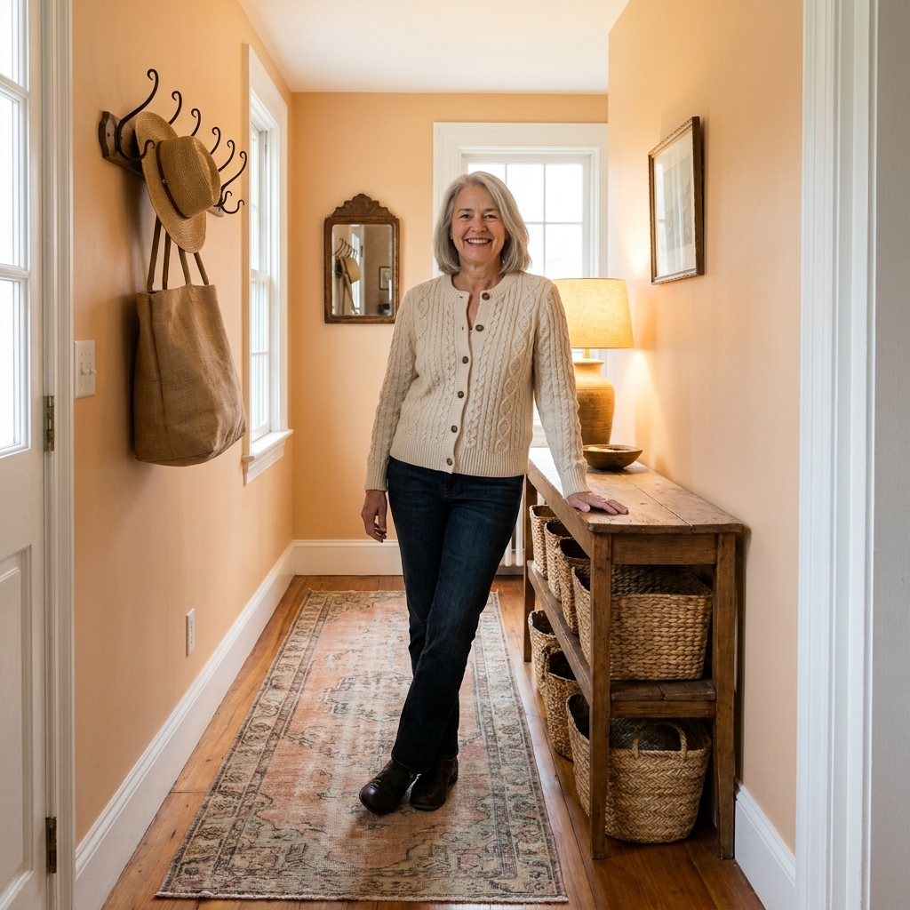
Entry bench
- Raw wood bench
- Woven basket underneath (for shoes or throws)
- Knit throw folded imperfectly in the basket
- Galvanized hooks or a small metal bin for mail
Common mistakes
Everything is the same texture
Fix: If your room is mostly smooth, add one chunky element (knit, basket, rough wood). If your room is mostly rustic, add one refined element (linen drapes or a tailored pillow).
Not enough contrast
Fix: Put a cool material next to a warm one. Galvanized beside wood. Linen beside metal. That contrast makes each piece look more intentional.
Too many small items
Fix: Trade three small decor pieces for one larger texture statement, like a substantial knit throw, oversized linen curtains, or a thick wood cutting board leaned against a backsplash.
Washed out at night
Fix: Warm lighting brings texture to life. Add a table lamp with a linen shade or swap to warm bulbs so your knits and wood tones glow instead of fading.
Scale matters
If your room still feels flat even after you have “all the right pieces,” check the scale. Texture is easiest to read when at least one element is oversized: a big knit throw, long linen curtains, a substantial wood table, or a large woven basket. One bold texture, plus a few smaller supporting layers, beats a dozen tiny objects every time.
Budget-friendly upgrades
You do not need a whole room makeover. A few smart swaps go a long way.
- Thrift a wood stool and leave it imperfect, just clean and wax.
- Make no-sew pillow covers from linen remnants or drop cloth for that farmhouse weave.
- Use a galvanized bucket as a planter for grocery-store greenery.
- Shop your own house: a cutting board, a woven basket, an old quilt can all become texture layers.
Quick checklist
- At least two soft textiles (knit, quilt, nubby pillow)
- At least one relaxed textile (linen curtain, runner, slipcover)
- At least one raw wood element with visible grain
- At least one metal accent (galvanized, iron, aged brass)
- Something living or organic (greenery, branches, dried stems)
- A mix of matte and subtle shine
If you are missing one category, add it. If you have all of them but it still feels flat, shift the scale and go bigger on one texture so the room has a focal point you can feel.
FAQs
How many textures do I need?
Aim for at least five: a chunky textile (knit or quilt), a tight-weave smooth textile (like percale, canvas, or a crisp cotton pillow), a relaxed textile (like linen), a natural hard material (wood), and a cool hard material (galvanized or iron). Repeat them throughout the room so it feels cohesive.
Can I layer texture without patterns?
Absolutely. Texture is often stronger than pattern in a neutral palette. Think: cable knit, slubby linen, wood grain, and lightly weathered metal. If you want one gentle pattern, a thin stripe or ticking keeps it calm.
What if I already have a lot of wood?
Then let linen and metal do more of the work. Add airy linen curtains, a linen slipcover, or linen napkins and runners. Use galvanized accents to add contrast so all that warmth does not turn heavy.